
今回もRネタである.論文の図を作成していて,ggplot2のfacetを使用して作成した図の中のfacet毎に異なる有意差を示す群を線分で結んで,その上にasteriskを色を変えてつけようとしたところ,結構苦労したので忘れないうちにまとめておく.annotate()というのもあるが,これだとすべてのfacetに同じ内容が入ってしまう.今回の目的であるfacetによって異なる内容の注釈を入れるためには,geom_segmentやgeom_textを使う.
References
- ggplot2を使って、注釈を入れる-2
- Adding different annotation to each facet in ggplot
- Add a segment only to one facet using ggplot2
Data Preparation
まず,架空のデータを作成する.Drug1とDrug2を投与して1日後と7日後の物質Xの血中濃度変化を対照,つまり投与前と比較するという実験において,Drug1では差がなく,Drug2では差があるという結果にする.
set.seed(100)
data.df1 <- data.frame(Control = rnorm(20, mean = 5, sd = 1),
                       Day1 = rnorm(20, mean = 5, sd = 1.5),
                       Day7 = rnorm(20, mean = 5, sd = 2))
library(reshape)
data_melt.df1 <- melt(data.df1)

data.df2 <- data.frame(Control = rnorm(20, mean = 5, sd = 1.8),
                       Day1 = rnorm(20, mean = 10, sd = 5),
                       Day7 = rnorm(20, mean = 20, sd = 7))
data_melt.df2 <- melt(data.df2)

data_melt.df <- cbind.data.frame(data_melt.df1, data_melt.df2$value)
colnames(data_melt.df) <- c("Day","Drug1","Drug2") # chage column name of dataframe
head(data_melt.df)
Using  as id variables
Using  as id variables
      Day    Drug1    Drug2
1 Control 4.497808 4.528408
2 Control 5.131531 4.876081
3 Control 4.921083 4.318010
4 Control 5.886785 9.647526
5 Control 5.116971 5.233701
6 Control 5.318630 3.716555
これで解析用のデータが出来上がった.一応,差を確認してみる.
Tukey multiple comparison
Tukeyの多重比較試験を行う.2つの方法で確認しておく.
TukeyHSD
TukeyHSD(aov(data_melt.df$Drug1~data_melt.df$Day))
  Tukey multiple comparisons of means
    95% family-wise confidence level

Fit: aov(formula = data_melt.df$Drug1 ~ data_melt.df$Day)

$`data_melt.df$Day`
                    diff       lwr      upr     p adj
Day1-Control  0.03086351 -1.274284 1.336011 0.9982163
Day7-Control -0.14426065 -1.449408 1.160887 0.9617765
Day7-Day1    -0.17512416 -1.480272 1.130023 0.9442066
TukeyHSD(aov(data_melt.df$Drug2~data_melt.df$Day))
  Tukey multiple comparisons of means
    95% family-wise confidence level

Fit: aov(formula = data_melt.df$Drug2 ~ data_melt.df$Day)

$`data_melt.df$Day`
                  diff       lwr       upr     p adj
Day1-Control  4.874433  1.128239  8.620628 0.0076229
Day7-Control 15.114597 11.368403 18.860791 0.0000000
Day7-Day1    10.240164  6.493970 13.986358 0.0000000
テューキーの方法による多重比較
source("http://aoki2.si.gunma-u.ac.jp/R/src/tukey.R", encoding="euc-jp")
tukey(data_melt.df$Drug1, data_melt.df$Day)
$result1
        n     Mean Variance
Group1 20 5.107867 0.516335
Group2 20 5.138731 1.188671
Group3 20 4.963606 7.119660

$Tukey
             t         p
1:2 0.05690583 0.9982163
1:3 0.26598637 0.9617765
2:3 0.32289220 0.9442066

$phi
[1] 57

$v
[1] 2.941555
tukey(data_melt.df$Drug2, data_melt.df$Day)
$result1
        n      Mean Variance
Group1 20  4.811422  4.07251
Group2 20  9.685855 32.74563
Group3 20 19.926019 35.88609

$Tukey
           t            p
1:2 3.131158 7.622857e-03
1:3 9.709065 1.156397e-11
2:3 6.577907 4.783876e-08

$phi
[1] 57

$v
[1] 24.23474
以上で,Drug1では物質Xの濃度はコントロールと差がないこと,Drug2ではコントロール,Day1,Day7の間に有意差が認められることが確認された.そのようにデータを作ったので当たり前である...(^^;;;;;
Boxplot by ggplot2
ようやくここから上記のデータを使って,ggplot2でboxplotを描いてみる.まずはmeltを用いてwide formatからlong formatへのデータの整形を行う.
DataM <- melt(data_melt.df, id = "Day")
head(DataM)
      Day variable    value
1 Control    Drug1 4.497808
2 Control    Drug1 5.131531
3 Control    Drug1 4.921083
4 Control    Drug1 5.886785
5 Control    Drug1 5.116971
6 Control    Drug1 5.318630
Calculate mean and SE
平均とSEも求めておく.
library(plyr)
DataM_summary <- ddply(DataM, .(variable, Day), summarise, N = length(value), mean = mean(value), sd = sd(value), se = sd(value)/sqrt(length(value)))
DataM_summary
  variable     Day  N      mean        sd        se
1    Drug1 Control 20  5.107867 0.7185645 0.1606759
2    Drug1    Day1 20  5.138731 1.0902617 0.2437899
3    Drug1    Day7 20  4.963606 2.6682692 0.5966431
4    Drug2 Control 20  4.811422 2.0180460 0.4512488
5    Drug2    Day1 20  9.685855 5.7223794 1.2795629
6    Drug2    Day7 20 19.926019 5.9904997 1.3395165
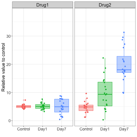
ついで,ggplot2のggplotでboxplotを描く.個々のデータをgeom_jitter,あるいは,geom_pointを用いて重ねてプロットしておく.どちらの方法でも下記のように同じ図になる.
geom_jitter
library(ggplot2)
TestBoxPlot <- ggplot(DataM, aes(x = Day, y = value, colour = Day, fill = Day)) +
    geom_boxplot(alpha = 0.40) +
    facet_wrap(~variable, ncol = 3, scales="fixed") +
    coord_cartesian(ylim = c(0,38)) +
    theme_bw() +
    theme(axis.text.x  = element_text(size=14), axis.text.y = element_text(size=14), strip.text.x = element_text(size =16)) +
    theme(axis.title.x = element_text(size=14), axis.title.y = element_text(size=16), plot.title=element_text(size=0)) +
    xlab("") +
    ylab("Relative value to control") +
    theme(legend.position = "none") +   # delete legend
    geom_jitter(shape=16, size=2, position=position_jitter(0.1))  # plot individual point with jittering

TestBoxPlot
geom_point
TestBoxPlot2 <- ggplot(DataM, aes(x = Day, y = value, colour = Day, fill = Day)) +
    geom_boxplot(alpha = 0.40) +
    facet_wrap(~variable, ncol = 3, scales="fixed") +
    coord_cartesian(ylim = c(0,38)) +
    theme_bw() +
    theme(axis.text.x  = element_text(size=14), axis.text.y = element_text(size=14), strip.text.x = element_text(size =16)) +
    theme(axis.title.x = element_text(size=14), axis.title.y = element_text(size=16), plot.title=element_text(size=0)) +
    xlab("") +
    ylab("Relative value to control") +
    theme(legend.position = "none") +   # delete legend
    geom_point(aes(fill = Day), size = 2, shape = 16, position = position_jitterdodge())  # plot individual point with jittering

TestBoxPlot2

Add mean bar
Ref: combine ggplot facet_wrap with geom_segment to draw mean line in scatterplot
平均値のバーを書き込む.これはgeom_segmentを使うが,すべてのfacetに書き込むので,単純である.
TestBoxPlot3 <- TestBoxPlot +
    geom_segment(data = DataM_summary, aes(x=as.numeric(as.factor(Day)) - 0.5,
                                           xend=as.numeric(as.factor(Day)) + 0.5,
                                           yend=mean,
                                           y=mean,
                                           colour=Day,
                                           alpha=0.7),
                 size = 1.5, linetype = 1)

TestBoxPlot3
Add segment and asterisk to Drug2 facet of boxplot
Dataframe for annotation
ここからが本番である.上記で作成したグラフを見ながら,どこからどこに線を引けばよいのか,どこにasteriskを置けばよいのか大体の見当をつけたうえで,注釈用のデータフレームを別途作成する.これは手作業でやらざるを得ない.できたグラフを見て微調整をしていく.
anno <- data.frame(
    x=c(0.9, 0.9, 3.1, 1.1, 1.1, 1.9, 2.1, 2.1, 2.9),
    y=c(10.5, 37, 37, 10.5, 26, 26, 23.5, 34, 34),
    xend=c(0.9, 3.1, 3.1, 1.1, 1.9, 1.9, 2.1, 2.9, 2.9),
    yend=c(37, 37, 32.5, 26, 26, 23.5, 34, 34, 32.5),
    variable="Drug2",
    xstar = c(1.5, 2, 2.5, NA, NA, NA, NA, NA, NA),
    ystar = c(27, 38, 35, NA, NA, NA, NA, NA, NA),
    lab = c("**", "***", "***", NA, NA, NA, NA, NA, NA),
    ast.color = c("red", "blue", "green", NA, NA, NA, NA, NA, NA))

anno
    x    y xend yend variable xstar ystar  lab ast.color
1 0.9 10.5  0.9 37.0    Drug2   1.5    27   **       red
2 0.9 37.0  3.1 37.0    Drug2   2.0    38  ***      blue
3 3.1 37.0  3.1 32.5    Drug2   2.5    35  ***     green
4 1.1 10.5  1.1 26.0    Drug2    NA    NA <NA>      <NA>
5 1.1 26.0  1.9 26.0    Drug2    NA    NA <NA>      <NA>
6 1.9 26.0  1.9 23.5    Drug2    NA    NA <NA>      <NA>
7 2.1 23.5  2.1 34.0    Drug2    NA    NA <NA>      <NA>
8 2.1 34.0  2.9 34.0    Drug2    NA    NA <NA>      <NA>
9 2.9 34.0  2.9 32.5    Drug2    NA    NA <NA>      <NA>
x, y, xend, yendは各線分の始点と終点で,xstar, ystarは注釈,今回はasteriskの位置を示す.labはasteriskそのものを指示し,colorはasteriskの色を指定している.
Add segment with geom_segment and asterisk with geom_text (black)
geom_segmentで線を引いて,geom_textでasteriskをつける.まずは黒色でやってみる. inherit.aes=FALSE をgeom_text()とgeom_segment()の内部に追加してggplot()内のfill=Dayを無視させる.
TestBoxPlot3 +
    geom_text(data = anno, aes(x = xstar, y = ystar, label = lab, colour = NULL), size = 7, family = "Times New Roman", inherit.aes = FALSE) +
    geom_segment(data = anno, aes(x = x,  y = y, xend=xend, yend=yend), inherit.aes = FALSE)

Add segment with geom_segment and asterisk with geom_text (color)
asteriskに色をつける.データフレーム annoに書き込んだ色データを明示的に指示して利用する.
TestBoxPlot3 +
    geom_text(data = anno, aes(x = xstar, y = ystar, label = lab), colour = anno$ast.color, size = 7, family = "Times New Roman", inherit.aes = FALSE) +
    geom_segment(data = anno, aes(x = x,  y = y, xend=xend, yend=yend), inherit.aes = FALSE)
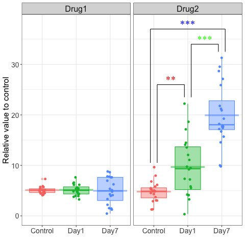
問題はここである.どうしても, colour = anno$ast.color とデータフレームと変数を明示的に指示しないと色がおかしくなるか,エラーになってしまう.もっとうまくggplotにデータを読ませる方法をどなたかご教示いただければ幸甚である.
Barplot by ggplot2
次にbarplotを描いて同じことをやってみる.エラーバーは慣例通りSEにする.
Barplot
TestBarPlot <- ggplot(DataM_summary, aes(x = Day, y = mean, colour = Day, fill=Day)) +
    geom_errorbar(aes(ymin = mean, ymax = mean + se), width = 0.2) +
    geom_bar(position=position_dodge(), stat="identity", alpha=1/2, width=0.5) +
    facet_wrap(~variable, scales = "fixed", ncol=3) +
    coord_cartesian(ylim = c(0,30)) +
    theme_bw() +
    theme(axis.text.x  = element_text(size=14), axis.text.y = element_text(size=14), strip.text.x = element_text(size =16)) +
    theme(axis.title.x = element_text(size=14), axis.title.y = element_text(size=16), plot.title=element_text(size=0)) +
    xlab("") +
    ylab("Relative value to control") +
    theme(legend.position = "none")   # delete legend

TestBarPlot

Add segment and asterisk to Drug2 facet of barplot
Dataframe for annotation
anno2 <- data.frame(
    x=c(0.9, 0.9, 3.1, 1.1, 1.1, 1.9, 2.1, 2.1, 2.9),
    y=c(6.5, 29, 29, 6.5, 17, 17, 12.5, 25, 25),
    xend=c(0.9, 3.1, 3.1, 1.1, 1.9, 1.9, 2.1, 2.9, 2.9),
    yend=c(29, 29, 22.5, 17, 17, 12.5, 25, 25, 22.5),
    variable="Drug2",
    xstar = c(1.5, 2, 2.5, NA, NA, NA, NA, NA, NA),
    ystar = c(17.5, 29.5, 25.5, NA, NA, NA, NA, NA, NA),
    lab = c("**", "***", "***", NA, NA, NA, NA, NA, NA),
    ast.color = c("red", "blue", "green", NA, NA, NA, NA, NA, NA))

anno2
    x    y xend yend variable xstar ystar  lab ast.color
1 0.9  6.5  0.9 29.0    Drug2   1.5  17.5   **       red
2 0.9 29.0  3.1 29.0    Drug2   2.0  29.5  ***      blue
3 3.1 29.0  3.1 22.5    Drug2   2.5  25.5  ***     green
4 1.1  6.5  1.1 17.0    Drug2    NA    NA <NA>      <NA>
5 1.1 17.0  1.9 17.0    Drug2    NA    NA <NA>      <NA>
6 1.9 17.0  1.9 12.5    Drug2    NA    NA <NA>      <NA>
7 2.1 12.5  2.1 25.0    Drug2    NA    NA <NA>      <NA>
8 2.1 25.0  2.9 25.0    Drug2    NA    NA <NA>      <NA>
9 2.9 25.0  2.9 22.5    Drug2    NA    NA <NA>      <NA>
Add segment with geom_segment and asterisk with geom_text (color)
TestBarPlot +
    geom_text(data = anno2, aes(x = xstar, y = ystar, label = lab), colour = anno$ast.color, size = 7, family = "Times New Roman", inherit.aes = FALSE) +
    geom_segment(data = anno2, aes(x = x,  y = y, xend=xend, yend=yend), inherit.aes = FALSE)
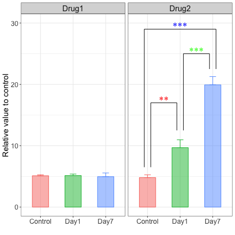
barplotでも全く同様のグラフを作成することができた.
なお,通常のグラフをpdfで出力して,それをOmniGraffleなどのお絵かきソフトに持っていき,手作業で線やasteriskを描いて,再びpdfで出力する,という荒業も使えないことはない.しかし,ggplotの中で完結できるので,余分で面倒な手作業が不要になった.まぁ,上記の作業も面倒ではあるが,再現性があり,他の人にも渡せるというところが重要であると思う.
Combine boxplot and barplot into the same graphic
Ref1: patchwork
Ref2: patchworkを使って複数のggplotを組み合わせる
patchworkを使えば,上記の2種のグラフを簡単に一つの図にできる.比較しやすいようにbarplotのy軸のスケールをboxplotと同じに修正しておく.
# Boxplot
P1 <- TestBoxPlot3 +
    geom_text(data = anno, aes(x = xstar, y = ystar, label = lab), colour = anno$ast.color, size = 7, family = "Times New Roman", inherit.aes = FALSE) +
    geom_segment(data = anno, aes(x = x,  y = y, xend=xend, yend=yend), inherit.aes = FALSE)

# Barplot
TestBarPlot2 <- ggplot(DataM_summary, aes(x = Day, y = mean, colour = Day, fill=Day)) +
    geom_errorbar(aes(ymin = mean, ymax = mean + se), width = 0.2) +
    geom_bar(position=position_dodge(), stat="identity", alpha=1/2, width=0.5) +
    facet_wrap(~variable, scales = "fixed", ncol=3) +
    coord_cartesian(ylim = c(0,38)) +
    theme_bw() +
    theme(axis.text.x  = element_text(size=14), axis.text.y = element_text(size=14), strip.text.x = element_text(size =16)) +
    theme(axis.title.x = element_text(size=14), axis.title.y = element_text(size=16), plot.title=element_text(size=0)) +
    xlab("") +
    ylab("Relative value to control") +
    theme(legend.position = "none")   # delete legend
P2 <- TestBarPlot2 +
    geom_text(data = anno2, aes(x = xstar, y = ystar, label = lab), colour = anno$ast.color, size = 7, family = "Times New Roman", inherit.aes = FALSE) +
    geom_segment(data = anno2, aes(x = x,  y = y, xend=xend, yend=yend), inherit.aes = FALSE)

library(patchwork)
P1 + P2
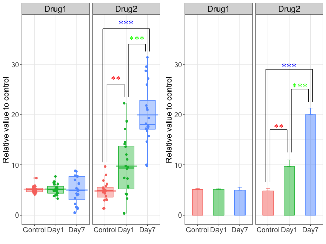
このpatchworkは足し算だけで2つの図の合体ができてしまうすぐれもの.ちゃんと位置合わせなども自動的にしてくれる.素晴らしい.
しかし,こうして並べて比べてみると,barplotが如何に情報量の少ないグラフであるかが一目瞭然である.